
From a limited medical landing page to a complete digital platform for the clinic. The new website structures complex medical content and guides patients from their first question to choosing a doctor and booking an appointment.
Role
Product / UI/UX Designer
Scope
Responsibilities
Information architecture, UX, visual direction, UI design, responsive layouts, and component system
Information architecture, UX, visual direction, UI design, responsive layouts, and component system
Year / Market / Stage
2026 / Russia / Design completed
THIRD EYE
The website needed to position Third Eye as a modern medical centre with strong expertise while remaining clear, calm, and approachable for patients.
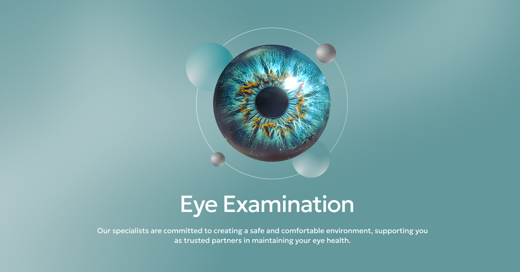
The visual direction balances medical precision with a supportive and reassuring tone. A turquoise palette, light surfaces, soft gradients, and large-scale imagery of medical equipment create a technological identity without making the experience feel sterile or distant.
The interface remains restrained. Visual accents support navigation, while information about doctors, services, and treatment methods stays at the centre of the experience.
The visual direction balances medical precision with a supportive and reassuring tone. A turquoise palette, light surfaces, soft gradients, and large-scale imagery of medical equipment create a technological identity without making the experience feel sterile or distant.
The interface remains restrained. Visual accents support navigation, while information about doctors, services, and treatment methods stays at the centre of the experience.
Visual Direction
Visual Direction

‹ ›

The existing website no longer reflected the scale of the clinic or the range of services it provided. A large amount of information was placed within a limited structure, making it difficult for users to quickly find the right medical service, doctor, price, or appointment details.
The goal was to transform the landing page into a multi-page corporate website that could:
The goal was to transform the landing page into a multi-page corporate website that could:
- introduce the clinic and communicate its expertise;
- help patients choose a service or treatment area;
- provide detailed information about doctors and medical equipment;
- make prices and documents easy to access;
- answer common patient questions;
- guide users towards booking an appointment.
Idea and task
From a limited landing page to a complete digital platform

mind map

The work began with restructuring the information architecture. The content was organised into clear user-focused sections so that the website would not feel like a long, unstructured list of medical services.
The main sections included:
Home / About the Clinic / For Patients / Services / Doctors / Prices / Contacts
Supporting pages covered medical equipment, documents, patient guides, promotions, tax deduction information, frequently asked questions, testimonials, and detailed service descriptions.
This structure supports different entry points and user intentions. A patient can search for a specific procedure, choose a doctor, compare prices, or first learn more about the clinic and its expertise.
The main sections included:
Home / About the Clinic / For Patients / Services / Doctors / Prices / Contacts
Supporting pages covered medical equipment, documents, patient guides, promotions, tax deduction information, frequently asked questions, testimonials, and detailed service descriptions.
This structure supports different entry points and user intentions. A patient can search for a specific procedure, choose a doctor, compare prices, or first learn more about the clinic and its expertise.
Website Structure
Organising complex medical content


The final design covers the clinic’s core website sections: services, diagnostics, doctors, equipment, pricing, patient information, and appointment booking.
Each page type has its own content structure, while shared navigation and repeatable interface patterns keep the experience consistent across the website.
Medical pages often contain large amounts of complex information. To improve readability, the content was divided into shorter sections, cards, lists, and expandable elements.
The responsive layouts preserve the same hierarchy on smaller screens. Primary actions remain accessible, while complex content is reorganised into a clear sequential reading experience.
Each page type has its own content structure, while shared navigation and repeatable interface patterns keep the experience consistent across the website.
Medical pages often contain large amounts of complex information. To improve readability, the content was divided into shorter sections, cards, lists, and expandable elements.
The responsive layouts preserve the same hierarchy on smaller screens. Primary actions remain accessible, while complex content is reorganised into a clear sequential reading experience.
Final Interface
A multi-page system for different patient needs
The visual system brings together different page types, from image-led brand sections to detailed procedure descriptions, pricing tables, and appointment forms.
It is based on Inter, large-scale typography, a modular grid, and a restrained palette of turquoise, aquamarine, and cool blue tones.
Turquoise highlights primary actions and key information. Lighter shades separate content areas, while darker surfaces add contrast to image-led and technology-focused sections.
The component system includes service and doctor cards, appointment buttons, information blocks, navigation elements, pricing tables, forms, and expandable content sections.
It is based on Inter, large-scale typography, a modular grid, and a restrained palette of turquoise, aquamarine, and cool blue tones.
Turquoise highlights primary actions and key information. Lighter shades separate content areas, while darker surfaces add contrast to image-led and technology-focused sections.
The component system includes service and doctor cards, appointment buttons, information blocks, navigation elements, pricing tables, forms, and expandable content sections.
Visual System
A consistent language for medical and service content


The original landing page was transformed into a complete multi-page website that systematically presents the clinic’s services, doctors, equipment, pricing, and patient information.
The new structure helps users find relevant content more quickly, understand medical services, and move towards booking an appointment.
The visual direction supports the clinic’s positioning as an experienced and modern medical centre, combining a technological identity with a calm and accessible patient experience.
The new structure helps users find relevant content more quickly, understand medical services, and move towards booking an appointment.
The visual direction supports the clinic’s positioning as an experienced and modern medical centre, combining a technological identity with a calm and accessible patient experience.
Result
Result
