

NDA* Dating App is a dating module within a social platform. Instead of a passive like, the first message serves as the primary interaction: users can express their interest immediately and start a conversation.
Role
Product / UI/UX Designer
Scope
Research, product logic, UX architecture, visual direction, UI design, and component system
Year / Market / Stage
2026 / Russia / MVP
NDA* Dating app
&love
message
First


The dating experience needed to feel less like a catalogue of profiles and more like a distinct emotional space within the wider product.
The visual direction is built around the idea of impulse — an immediate response reinforced through both visual language and interaction. A saturated red palette, soft glow, and pulsating accents create a sense of energy and live connection.
Microinteractions, haptic feedback, and sound support this idea, turning separate interface responses into a more cohesive sensory experience.
The interface itself remains minimal. Navigation and controls stay visually restrained, keeping the focus on the person and the moment of interaction.
The visual direction is built around the idea of impulse — an immediate response reinforced through both visual language and interaction. A saturated red palette, soft glow, and pulsating accents create a sense of energy and live connection.
Microinteractions, haptic feedback, and sound support this idea, turning separate interface responses into a more cohesive sensory experience.
The interface itself remains minimal. Navigation and controls stay visually restrained, keeping the focus on the person and the moment of interaction.
Visual Direction
An emotional space within a social platform


‹ ›
[NDA] Date was designed as a dating experience within a larger social platform. The goal was not only to create an interface for discovering profiles, but to identify a mechanic that could move users from interest to meaningful interaction more directly.
The research began with an overview of the Russian dating market, including product popularity and audience distribution.
I then conducted a comparative analysis of major dating services, focusing on likes, super likes, compliments, pre-match messages, profile structures, and interaction restrictions.
The analysis showed that messaging is already present in many products, but usually as an additional feature — an enhanced like, a paid option, or a secondary way to attract attention. In [NDA] Date, the first message became the primary action around which the dating journey was structured.
The research began with an overview of the Russian dating market, including product popularity and audience distribution.
I then conducted a comparative analysis of major dating services, focusing on likes, super likes, compliments, pre-match messages, profile structures, and interaction restrictions.
The analysis showed that messaging is already present in many products, but usually as an additional feature — an enhanced like, a paid option, or a secondary way to attract attention. In [NDA] Date, the first message became the primary action around which the dating journey was structured.
Idea and task
From browsing profiles to active interaction


The research began with an overview of the Russian dating market, including audience distribution and the popularity of leading services. I then conducted a comparative analysis of the key mechanics used across major dating products: likes, super likes, compliments, pre-match messages, profile structures, and interaction restrictions.
The analysis showed that messaging is already available in many products, but usually works as an additional mechanic — an enhanced like, a paid feature, or a secondary way to attract attention.
In [NDA] Date, the first message became the primary action around which the entire dating journey was structured.
The analysis showed that messaging is already available in many products, but usually works as an additional mechanic — an enhanced like, a paid feature, or a secondary way to attract attention.
In [NDA] Date, the first message became the primary action around which the entire dating journey was structured.
Research
How dating products structure first contact

Instead of responding to a profile with a passive like, the user starts with a message. This immediately communicates intent, gives the other person context, and creates a natural starting point for a conversation.
When interest is mutual, the original message remains visible on the match screen and becomes the first message in the chat. The user does not enter an empty conversation or have to restart the interaction from scratch.
This principle also shaped the product’s wider direction. The interaction does not end with a match or a chat: users can suggest a date idea, choose an event or restaurant, send flowers, or arrange a taxi — with the other person’s consent and without unnecessarily exposing personal data.
When interest is mutual, the original message remains visible on the match screen and becomes the first message in the chat. The user does not enter an empty conversation or have to restart the interaction from scratch.
This principle also shaped the product’s wider direction. The interaction does not end with a match or a chat: users can suggest a date idea, choose an event or restaurant, send flowers, or arrange a taxi — with the other person’s consent and without unnecessarily exposing personal data.
Core experience
The first message starts the entire interaction journey


The MVP covers the complete foundational dating journey:
The product architecture was also prepared for future integration with the wider services available across the social platform.
- onboarding and profile creation;
- profile setup and photo management;
- user discovery;
- sending the first message;
- forming a match;
- moving into chat;
- profile and account settings;
- core system states and edge cases.
The product architecture was also prepared for future integration with the wider services available across the social platform.
Final Experience
Core MVP scenarios
The dating experience reuses selected components from the main social platform, including navigation patterns, base controls, input fields, and system states.
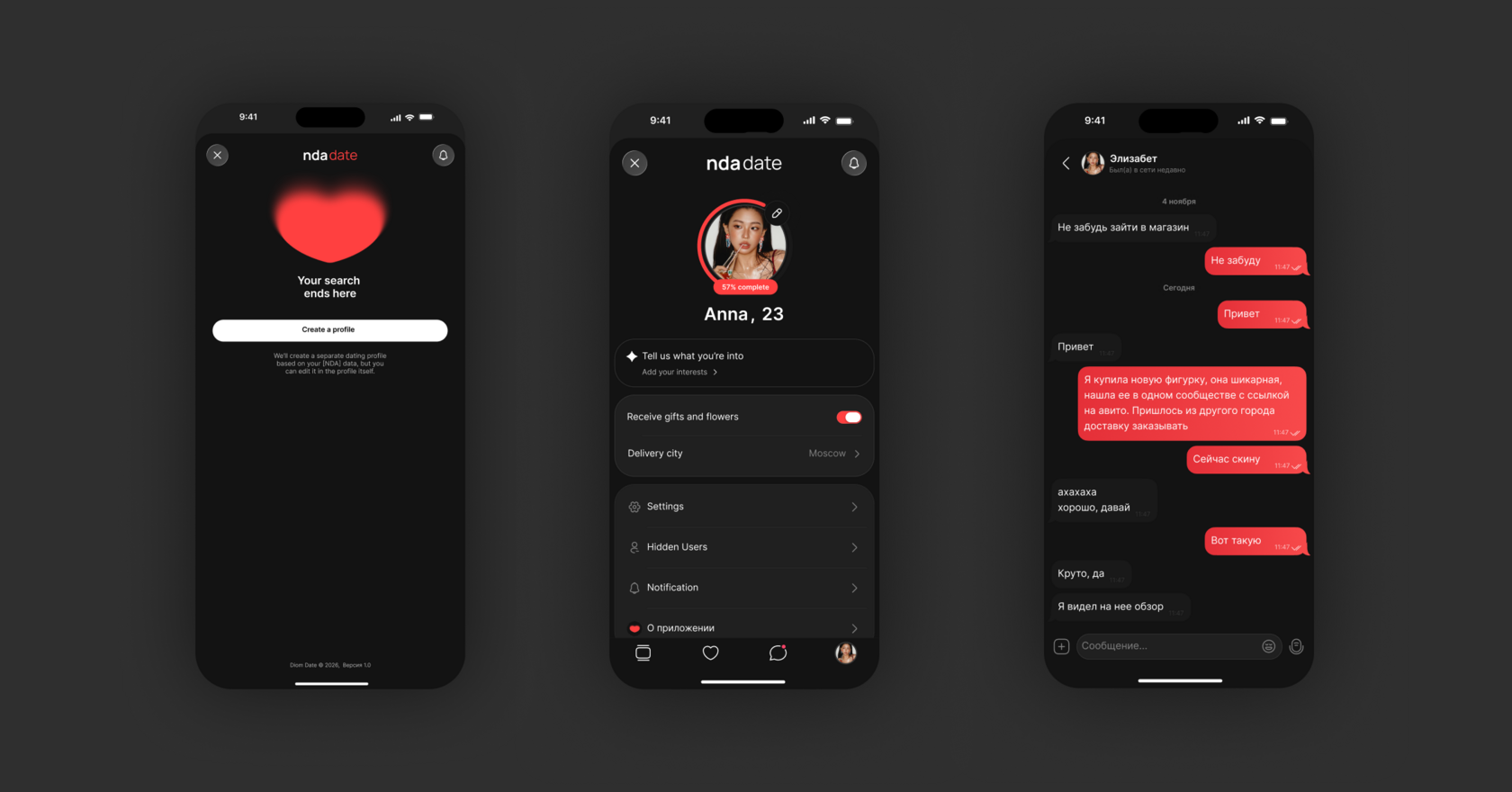
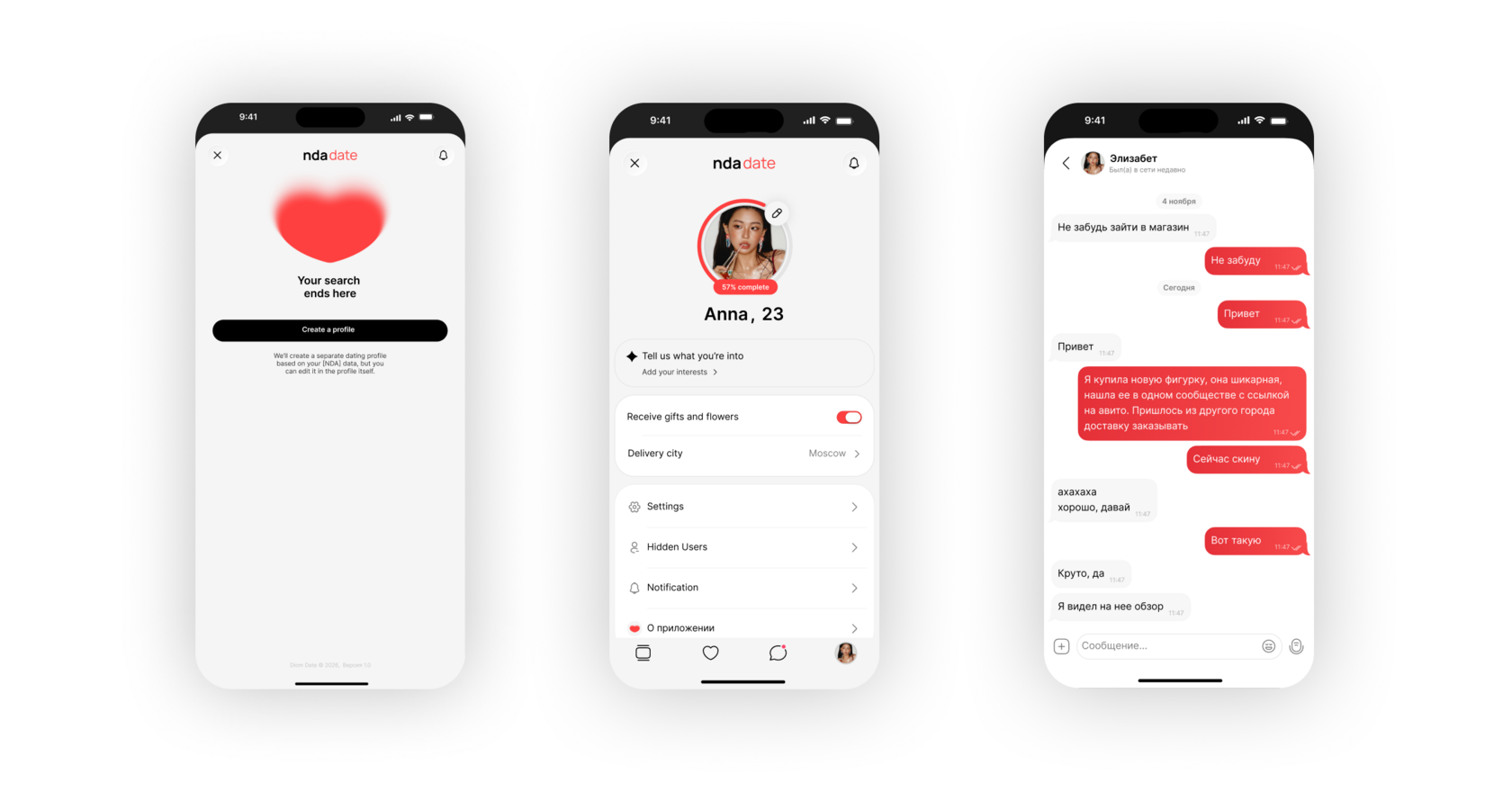
Scenario-specific elements were introduced for the dating journey: profile cards, interaction controls, the first-message pattern, the match screen, status indicators, and service cards.
The visual system balances emotionally charged content with a restrained interface layer. Large portrait photography creates the first impression, while the red palette and soft gradients define the product’s character. Typography, controls, and neutral surfaces maintain clarity without competing with the person in focus.
Scenario-specific elements were introduced for the dating journey: profile cards, interaction controls, the first-message pattern, the match screen, status indicators, and service cards.
The visual system balances emotionally charged content with a restrained interface layer. Large portrait photography creates the first impression, while the red palette and soft gradients define the product’s character. Typography, controls, and neutral surfaces maintain clarity without competing with the person in focus.
Visual System
An emotional identity built on top of the core product system


The final MVP connects the full dating journey — from profile discovery and the first message to a match, conversation, and future real-world interaction.
The first-message mechanic became more than an additional feature. It established the product’s core interaction model, provided context at every stage of the journey, and created a more intentional path from interest to conversation.
The same logic also provides a foundation for developing the product into a broader dating ecosystem that brings communication, events, restaurants, gifts, and mobility services together within one social platform.
The first-message mechanic became more than an additional feature. It established the product’s core interaction model, provided context at every stage of the journey, and created a more intentional path from interest to conversation.
The same logic also provides a foundation for developing the product into a broader dating ecosystem that brings communication, events, restaurants, gifts, and mobility services together within one social platform.
Result
Final line
NDA* This case study uses the placeholder name [NDA] Date. Some product details and visual elements have been adapted for public presentation.